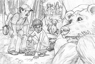
 Here are some sketches for a new illustration. The final will be handled much like the previously posted Kids vs Squirrel. The top sketch is nearly ready for transferring to illustration board and painting. The bottom sketch is earlier in the process.
Some of the changes I made between the two versions and why:
- I moved the bear up. He now has more presence, he's also bigger/closer to the viewer
- The dog is more animated and stylized - a little goofy looking. I like that!
- The kneeling boy has been nerdified - I think that makes him more distinctive.
- I changed the standing boys gaze and expression to differentiate him from the kneeling boy.
- Details! Between the two drawing I spent time studying: bears, canteens, hiking boots, trees and ferns. I also took some reference photos of myself (and my wife) assuming the poses in the illustration.

5 comments:
Nice concept! I like the composition, poses, and expressions. The style is more realistic than some of you other work. I prefer the more cartoony stuff but this isn't bad by any means; just a bit more traditonal. Best of luck with next steps!
It is really great to be privy to the process that artists go through to revise their work. The revision for the work that I do (writing) isn't nearly as much fun to witness.
You're absolutely right about the dog!
I'm eager to see what happens next!
Hi Robert! We met at the New England SCBWI conference. I love this sketch! Lots of character & great composition. I look forward to seeing the finished piece- I love the finish for "Squirrels", too!
really kicked it up from rough to the more tightened version! great stuff!
Cool to see the changes made, well done!
Post a Comment