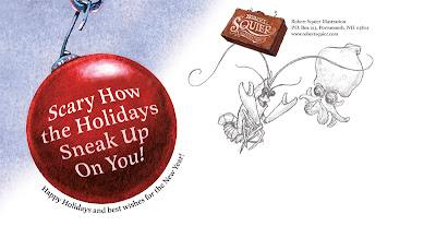
 Once again I have an evil Holiday card. I don't set out to be twisted. Sick ideas pop into my head and those are the ideas I like! Last year, I had the idea of two mice shopping for a gingerbread house. Cute! The final card featured a hungry cat lurking in the shadows. I guess I don't do cute.
This year's "card" is actually a postcard. A giant (sumo), 6 x 11 postcard. You've seen the front; here's the back:

I wanted to include sketches on the back because, well, people like my sketches! Heck, I like my sketches! Sketches often have an energy that the finished painting lacks. Also, It's a peek into my process (for those poor people that don't visit my blog!). And the critters will be grinning happily at the name on the mailing address! That should make the recipient feel special.
I had the final acrylic painting professionally scanned (the original doesn't fit on my scanner). I was disappointed with the results. The bulb and shrimp were blown out (too red). The blue scanned too bright. The angler fish (that fades into the darkness in the original painting) glowed like a neon sign. Frustrating. I managed to salvage the scan in Photoshop.
For those familiar with PS I did most of the color correction on the individual CMYK channels. Ex: I reduced the red by editing the magenta and yellow channels. I used a brush (low opacity/color dodge) to lighten the channel without destroying the detail.
And good news! My friends at Harbour Light will be using this as their Holiday card – and they will pick up the cost of printing! If that wasn't cool enough – the card will be printed with a spot gloss varnish on the foreground critters (and bubbles)! The final piece should really POP! Here's a closeup. Thanks for reading!


