Wishing you and your loved ones a smashing good Holiday Season!
Friday, December 16, 2011
Thursday, October 13, 2011
Leave That Thing Alone
Last night, when I really should have been working on an illustration gig, I did this… this… THING.
John Carpenter's 1982 classic, The Thing, centers around a shape-shifting alien that can perfectly mimic other life forms. When the alien infiltrates an isolated Antarctica outpost, the human inhabitants are discreetly taken over one by one. The remaining humans don't know who amongst them is human... or a THING. And hilarity ensues.
The movie blew my mind as a kid. The creature design was demented, horrifying and totally original – and I LOVED it. The wild creativity I saw unleashed on the screen was profoundly inspiring. Yeah, I was weird kid…
Tomorrow a prequel to The Thing, entitled The Thing, is being released. My expectations for the film are low–but I'm looking forward to revisiting that world. Both the world of The Thing and the world of my youth.
So rather than working last night I played. I drew The Thing and I had a blast. I suspect I'll soon be visiting more creatures from my youth: Godzilla, Alien, Evil from Time Bandits, The Creature from the Black Lagoon… hey, I'm feeling kinda inspired. I guess looking back can do that for a person.
Sunday, October 2, 2011
Ramona Quimby Show Poster
 |
| Initial, ugly sketch. |
In case you're not familiar with Ramona Quimby, she's a pugnacious and imaginative girl featured in a series of books by Beverly Cleary. The character has appeared in movies, on television and a stage play. My illustration of Ramona is for the Los Altos Youth Theater production of Ramona Quimby.
The theater needed a poster and a t-shirt design. The poster would be printed in color. The t-shirt needed to be line art only.
 |
| Digital sketch done in Photoshop. |
Once I had a sketch, I started the line art for the t-shirt. In the past, I'd do this type of work with a brush and ink, but I've gotten more comfortable "inking" on the computer. The Ramona illustration was "inked" in Photoshop. I traced my hand drawn lettering in Adobe Illustrator. Eventually, both elements (Ramona illustration and lettering) were combined in Illustrator and converted into a vector file for the t-shirt printer.
 |
| Line art version of the image for screen-printing t-shirts. |
Unlike the t-shirt, the poster art had no limitations. I based Ramona's color scheme on a production photo. I chose the yellow because it's a warm, eye-catching color – and the dark teal because it compliments the other colors while providing enough contrast to pop.
Friday, September 9, 2011
Hidden Picture Cover
Hidden Pictures are a beloved and enduring staple of Highlights Magazine. Kids of all ages love searching for hidden objects within an illustrated scene. I say all ages, because my optometrist's staff is addicted to Hidden Pictures; they even compete against one another to see who can find the objects the fastest!
My friend, Chuck Dillon, is a Hidden Picture guru and has illustrated dozens of these puzzles. On several occasions he encouraged me to try one but I never got around to tackling such a challenge until I got assigned a cover for Hidden Pictures Magazine.
I was given a list of objects to hide, a rough sketch and the cover layout. Initially, I expected the challenge would be hiding the objects, but that was actually fun. The real challenge was working around the layout (masthead, headlines and barcode). Eventually, after lots of experimentation, everything fell into place.
Seeing my art on a magazine cover, on a newsstand, right alongside Highlights, High Five and, gasp, MAD, is a real treat and honor.
An unexpected treat has been watching friends and family try to find the hidden objects. I'm always surprised and amused by the order that people find objects. The ones that I think are obvious are often the last objects found. My dad was really stumped looking for the "bat." He was looking for a baseball bat – not a winged bat!
The issue is on newsstand now through October 18, 2011. FYI: there are six objects hidden on the cover…
 |
| Pencil sketch with some digital edits. |
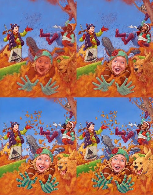 |
| Evolution of the digital painting process. |
Friday, July 29, 2011
From the Archive: Soho Pub T-shirt
I created this t-shirt illustration for a bar in Old Orchard Beach, Maine – many, many years ago. I don't think I was even old enough to drink at the time.
I did the original line art on tracing paper with a brush and ink. I added the color digitally, and those files are lost, most likely on a hard drive in a landfill somewhere. And even if I had the files, I probably couldn't open them. I was using Photoshop 3 and "painting" with the Paint Bucket tool.
I was just learning Photoshop and the Paint Bucket tool was the greatest thing. Soon I discovered its limitations, including the white "jaggies" it left behind on anti-aliased lines.
Both Photoshop and I have come a long way...
Monday, June 20, 2011
Highlights: Bear Rides!
These bears at a fair are in the July 2011 issue of Highlights magazine. This drawing illustrates a story entitled "Bear Rides!" by Maggie Murphy. The story is also a rebus. And for the folks scratching their fur thinking, "what's a rebus?" – a rebus is type of puzzle where certain words are replaced with a drawing that represents that word. Here's an example:
 |
| This is NOT, I repeat NOT how it was used in the magazine. |
The folks Highlights wanted a dynamic composition, with the rocket ride high in the air and the fairgrounds far below. After trying to create this scene in my head, I decided I needed some reference. So I put on my engineering hat and engineered this:
 |
| I've got MAD engineering skills. |
This silly contraption helped me visualize the rockets in relation to each other and to the arms of the ride.
And here are close-ups of the different characters:
And some more of the icons I created for the rebus.
And an early, ugly sketch:
 |
| These bears look like they're about to hurl. |
Monday, May 23, 2011
Talkin' About Style
 So, where does an artist's style come from?
That was the question that I, along with fellow illustrators, Susan Savory, Andy J. Smith and Teri Weidner, attempted to answer at the 25th Annual NESCBWI Conference last weekend. (For those unfamiliar with that acronym, it stands for the New England Society of Children's Book Writers and Illustrators.)
Susan, Andy, Teri and I hosted a workshop entitled - deep breath - The Search for a Singular Style: An Exploration for Illustrators. Phew. That was a mouthful.
We kicked off our presentation with slides of our work. And because we wanted to show apples and apples, each of us illustrated a scene from Three Billy Goats Gruff.
 Susan Savory's whimsical and mystical illustrations are done with cut paper.
 Andy J Smith's work is wacky fun and created digitally.
 Teri Weidner's watercolors are beautiful and traditional.
 And then there's me, with my slightly twisted humor. This is a drawing with ink wash, digitally colored.
The talk was essentially divided into two parts.
First, we
 discussed the roots or foundation of style and those (according to us) are Influences, Voice, Experimentation and Practice. This portion of talk featured our own personal stories and work. And for the record, the book How To Draw the Marvel Way was a huge influence on me--that and Wacky Packages!
The second half of the talk explored elements of style, the qualities intrinsic to every illustration that can often be taken for granted. We showed several varied examples of each element of style and urged the attendees to question their approach to each of the following:
• Character Design
• Color
• Line
• Medium
• Texture
• Tight vs Loose
• Composition
As an example: when talking about color, we suggested that skies don't have to be blue (and grass green.) Sometimes just introducing less-than-expected color choices (red, turquoise, lavender skies) can shake up an artist's style and make their work stand out.
We packed a LOT into this presentation. Honestly, almost any topic covered could be expanded into its own workshop. Thanks to the great NESCBWI staff and to everyone who attended our little talk!
Sunday, May 22, 2011
Highlights: Dinosaur!
 The May 2011 Highlights Magazine features the poem, Dinosaur, by Myra Cohn Livingston -- illustrated by ME!
I've drawn lots of dinosaurs in my day but not many dino skeletons. After settling on a composition, I set out to learn the basic mechanics of my fossilized friend. I did this by studying dozens of dino, rhino and elephant skeletons.
I'm a big fan of the "drawing through method" which simply means drawing things as if they were made of glass. So rather than draw a big dino skull and guessing where the body, legs and tail might fall, I drew every body part, whether it showed in the final illustration or not. I then combined the bits and pieces in Photoshop and voila!


 "Drawing through" gives me confidence in my work -- and I hope it translates into more believable illustrations. Here's some early versions of the illustration.


Wednesday, January 26, 2011
The Truth About Witches

The Truth About Witches, a book I illustrated for Capstone Press, is out!

The book, written by Eric Braun, is a fun overview of witchiness–from folklore to the latest Hollywood blockbuster. I got to draw characters from The Wizard of Oz, The Little Mermaid, Hansel and Gretel, Harry Potter and even Tomie dePaola's Strega Nona!
While working on this book I came to the realization that drawing ugly is FUN! Fun and liberating. When drawing a witch, if I made the nose too big – who cares?! Heck, make it bigger! While creating these witch characters, the more exaggerated or twisted the better.
Drawing normal people–and in particular children–is more restrictive. If I draw a child with a big nose, there's a good chance that will age him or her; the child can quickly start looking like a diminutive adult.
I altered my digital-painting approach with this project by skipping a step. Rather than make one last precise and clean pencil drawing, and paint over that, I used my somewhat sketchy "rough" drawing underneath the digital color.
Why skip a step? Partially, it was a time-management issue. Also, I felt that my sketchy, "rough" drawings had more energy and life than the clean, traced versions. I'm happy with the final artwork and am glad I decided to streamline my process in this way.
 Copyright page (and cover image) with a couple witches concocting a spell.
 What does a Witch look like? This spread sums it up: pointy hat, rotten teeth, hairy wart and a pointy chin.
Saturday, January 22, 2011
Illustration Friday: Dusty
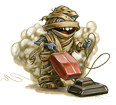
I created this little guy for the Illustration Friday topic "dusty."
I participated this week because I've been itching to try a different digital painting technique and rather than experiment on a client's project, I used this mummy as my guinea pig. Below is a breakdown of the steps and stages taken to create this illustration.
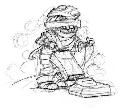
ROUGH SKETCH:
Here is the one (and only) rough sketch. Typically I spend more time exploring different poses and character design, but I was eager to start painting.
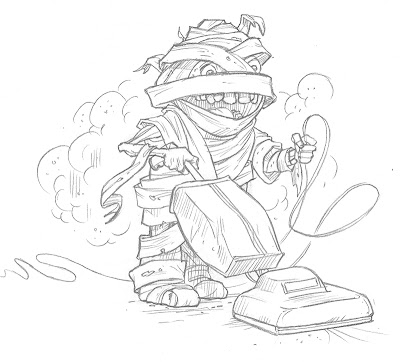
FINAL DRAWING:
I scanned the rough sketch and printed it at 5% opacity. The sketch printed very lightly, but dark enough that I could still see the lines. I drew the final drawing directly over the printout.
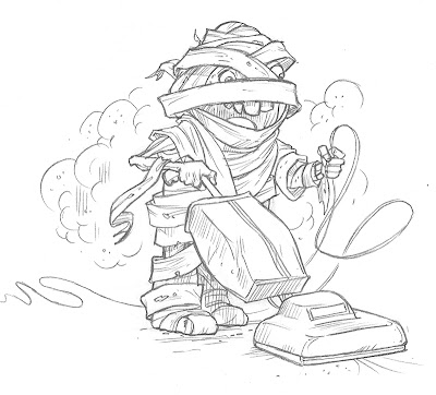
FINAL DRAWING 2:
After scanning the Final Drawing, I realized I preferred some of the details of the Rough Sketch. Using my drawing tablet (Wacom Cintiq), I changed the teeth and erased some bandages around the mummy's head.
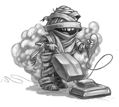
TONAL LAYER:
Here's where I started exploring a new painting technique. Before jumping into color, I painted the values. My hope is that by starting with lights and darks, the final drawing will have more clearly defined volume and structure. I'll also be more aware of how the lights and darks are organized in the composition.
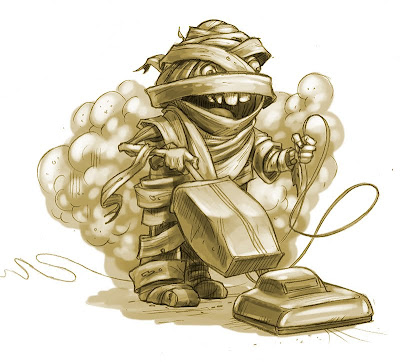
COLORIZE TONAL LAYER:
In traditional painting, adding black to darken colors can make for a muddy painting. Using Hue Saturation, I gave the tonal layer some warmth. Did I mention I'm working in Photoshop? I'm working in Photoshop.
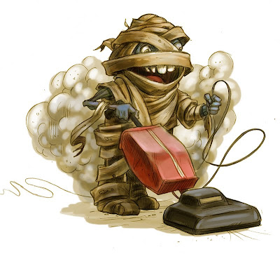
COLOR 1:
Here I started adding color in a layer set to "multiply." This tints the color effectively and works well in the darker values of the drawing.

COLOR 2:
Here's where the illustration really comes to life. On another layer set to "normal," I started adding color and line. The color on this layer is "opaque" and without it, the painting feels flat – like a tinted greyscale image.
I'm pleased with the final illustration. The tonal painting gave me a strong foundation for the color. Adding the lights and darks early also makes me more aware of their effect on composition and how the lights and darks lead the viewer's eye around the drawing.
I also used the project to experiment with character design. Typically, my people (or creatures) have natural proportions, whereas this mummy has a Charlie Brown body.
I had a blast creating this little guy.
Subscribe to:
Posts (Atom)


