
I created this little guy for the Illustration Friday topic "dusty."
I participated this week because I've been itching to try a different digital painting technique and rather than experiment on a client's project, I used this mummy as my guinea pig. Below is a breakdown of the steps and stages taken to create this illustration.
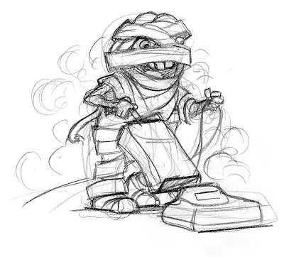
ROUGH SKETCH:
Here is the one (and only) rough sketch. Typically I spend more time exploring different poses and character design, but I was eager to start painting.
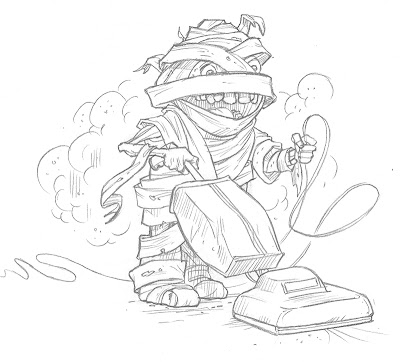
FINAL DRAWING:
I scanned the rough sketch and printed it at 5% opacity. The sketch printed very lightly, but dark enough that I could still see the lines. I drew the final drawing directly over the printout.
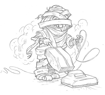
FINAL DRAWING 2:
After scanning the Final Drawing, I realized I preferred some of the details of the Rough Sketch. Using my drawing tablet (Wacom Cintiq), I changed the teeth and erased some bandages around the mummy's head.
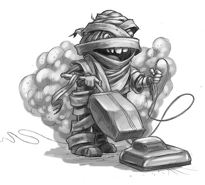
TONAL LAYER:
Here's where I started exploring a new painting technique. Before jumping into color, I painted the values. My hope is that by starting with lights and darks, the final drawing will have more clearly defined volume and structure. I'll also be more aware of how the lights and darks are organized in the composition.
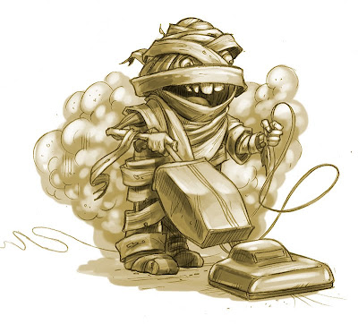
COLORIZE TONAL LAYER:
In traditional painting, adding black to darken colors can make for a muddy painting. Using Hue Saturation, I gave the tonal layer some warmth. Did I mention I'm working in Photoshop? I'm working in Photoshop.

COLOR 1:
Here I started adding color in a layer set to "multiply." This tints the color effectively and works well in the darker values of the drawing.

COLOR 2:
Here's where the illustration really comes to life. On another layer set to "normal," I started adding color and line. The color on this layer is "opaque" and without it, the painting feels flat – like a tinted greyscale image.
I'm pleased with the final illustration. The tonal painting gave me a strong foundation for the color. Adding the lights and darks early also makes me more aware of their effect on composition and how the lights and darks lead the viewer's eye around the drawing.
I also used the project to experiment with character design. Typically, my people (or creatures) have natural proportions, whereas this mummy has a Charlie Brown body.
I had a blast creating this little guy.

19 comments:
What a cool character! Thankyou for sharing your process - the final result is excellent :)
Love it! Great info on your process. Thanks for sharing.
Great painting, Robert. Thanks for sharing your process. I've started doing values underneath too, and it's really helped organize those.
Very nice! I love the illustration and enjoyed reading about your process.
Cheeky! I love it.
Great job! and thanks for sharing your process.
It is quite evident that you really enjoyed creating this illustration. Not over-thinking things and forcing yourself to experiment with character design and a new process has really paid off. This mummy is a lot of fun!
what a really really FUNNY illio! great idea that he'd be vaccuming up his own urm, self! :-))
this is great. Nice to see the progression.
Now, if only i can find a cute zombie to do some house dusting. : D
Thanks for sharing the process with us. Love the colours used.
W-o-n-d-e-r-f-u-l post!!! A really great character and so super that you shared your process. Thank you! Great work!
Absolutely gorgeous! thanks for sharing your process too!
Well done. Great image!
Very Cool, I loved seeing the progression!
Wow, awesome, love seeing all your steps to make your illustration!
Wonderful!Great to see the work in progress!
I really enjoyed your post and love the final result.
Most enlightening!
Wow! Loved seeing your process. Thanks for sharing. And great illo too!
Post a Comment