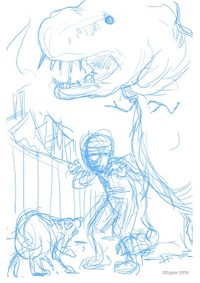
This ugly blue thumbnail sketch was created in Photoshop with my Wacom tablet.
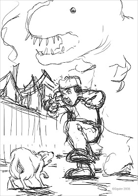
I then used black to draw on top of the blue. My goal here was to find the best lines from that blue mess above.
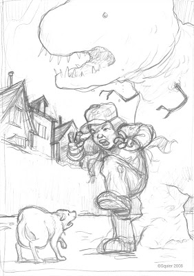
Next, I printed out the digital sketch and traced it on my light-box. The characters continue to evolve. I like my Wacom but it can't beat pencil and paper at this stage.
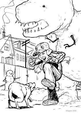
I rescanned the image and traced it again in Photoshop. At each step I continue to hone the characters, background and details.
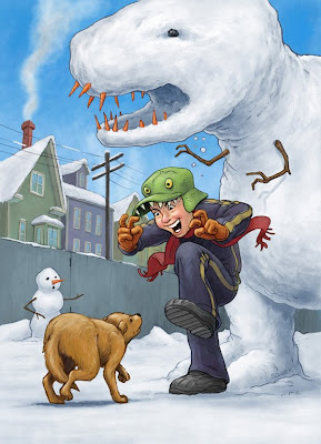
Done!

6 comments:
well these holiday card sketches look so good.
Nice to see your process; and that you struggle a bit like the rest of us before things fall into place. I think this is one of your best pieces ever! You were definitely "in the zone" when you created this one.
I like the way it all came together. You have a great eye for detail.
It's great to see your process. In my mind, you sit down and beautiful, full-color illustrations just flow onto the page. I'll probably cling to that illusion, but I enjoy seeing how it really works, too.
That's a great idea to start out the rough sketches in photoshop; I'm definitely going to give that a try. Nice seeing the process behind the illustration.
I was looking for a card sketch and stumbled onto your blog post . .. VERY awesome! I am in awe over anyone who can illustrate like you and your fans I am guessing :) Just a paper crafter/rubberstamper myself but WOW, if only I could draw half as good as you. :) Just had to leave some love . . .
Post a Comment