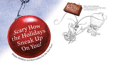
 Once again I have an evil Holiday card. I don't set out to be twisted. Sick ideas pop into my head and those are the ideas I like! Last year, I had the idea of two mice shopping for a gingerbread house. Cute! The final card featured a hungry cat lurking in the shadows. I guess I don't do cute.
This year's "card" is actually a postcard. A giant (sumo), 6 x 11 postcard. You've seen the front; here's the back:

I wanted to include sketches on the back because, well, people like my sketches! Heck, I like my sketches! Sketches often have an energy that the finished painting lacks. Also, It's a peek into my process (for those poor people that don't visit my blog!). And the critters will be grinning happily at the name on the mailing address! That should make the recipient feel special.
I had the final acrylic painting professionally scanned (the original doesn't fit on my scanner). I was disappointed with the results. The bulb and shrimp were blown out (too red). The blue scanned too bright. The angler fish (that fades into the darkness in the original painting) glowed like a neon sign. Frustrating. I managed to salvage the scan in Photoshop.
For those familiar with PS I did most of the color correction on the individual CMYK channels. Ex: I reduced the red by editing the magenta and yellow channels. I used a brush (low opacity/color dodge) to lighten the channel without destroying the detail.
And good news! My friends at Harbour Light will be using this as their Holiday card – and they will pick up the cost of printing! If that wasn't cool enough – the card will be printed with a spot gloss varnish on the foreground critters (and bubbles)! The final piece should really POP! Here's a closeup. Thanks for reading!


8 comments:
Is that the cat on your avatar? I wondered what that was all about.
How do I get a Christmas card, hmmmm?
Nice Halloween er--Christmas card. You definitely get the award for the most terrifying cards! Last year it was mice being tricked into being eaten, this year fishes. Will next year's card feature cute birds being mauled by a sadistic pilot's propeller blades? (Ha,ha.) I've got one word for you: therapy! Still, as an illustration, it's excellent. The fishes are rendered well and have convincing volume and personality. I do prefer your original, color sketch in many ways. Sometimes you just "nail it" from the onset. You don't always have to suffer for you art and work things to death. I'd like to see your next piece have a looser quality like the color sketch and the earlier sketch of the old man that you posted on this blog. The new scan of this card looks much better!
Glad you changed the bulb's "glow" from blue to red. It makes much more sense now. It was worth the extra effort. The card should look cool with the spot gloss the printer is doing. Very nice illustration!
Test. This whole blog thing is new to me. What's the proper way to respond to someone's comments? Here at my own blog?
Sure, you can respond to bloggers' comments on your own blog (that's what Scott "Atomic Robo" Wegener does.) Or, if you know the person's email address you can do it that way (if you want your comments to be for his/her eyes only...)
RS: Responded to the comment you posted on my blog. Go to my blog to read my insightful and witty response;)
Great card Robert! I for one enjoy a little dark humor at the holidays. There's plenty of happy snowmen, elves, and birds at this time of year to make room for something sinister.
And a little spot varnish on that will look super. Bravo!
Let's see some new stuff at least by early 2008! Merry Christmas and Happy New Year!
Post a Comment